ggplot2
Duke University
included in the tidyverse package
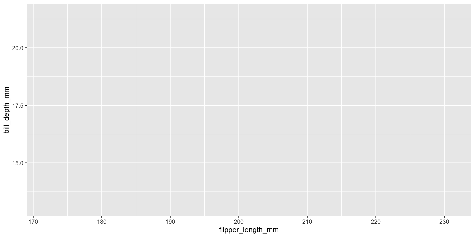
Blank canvas

x and y aesthetics
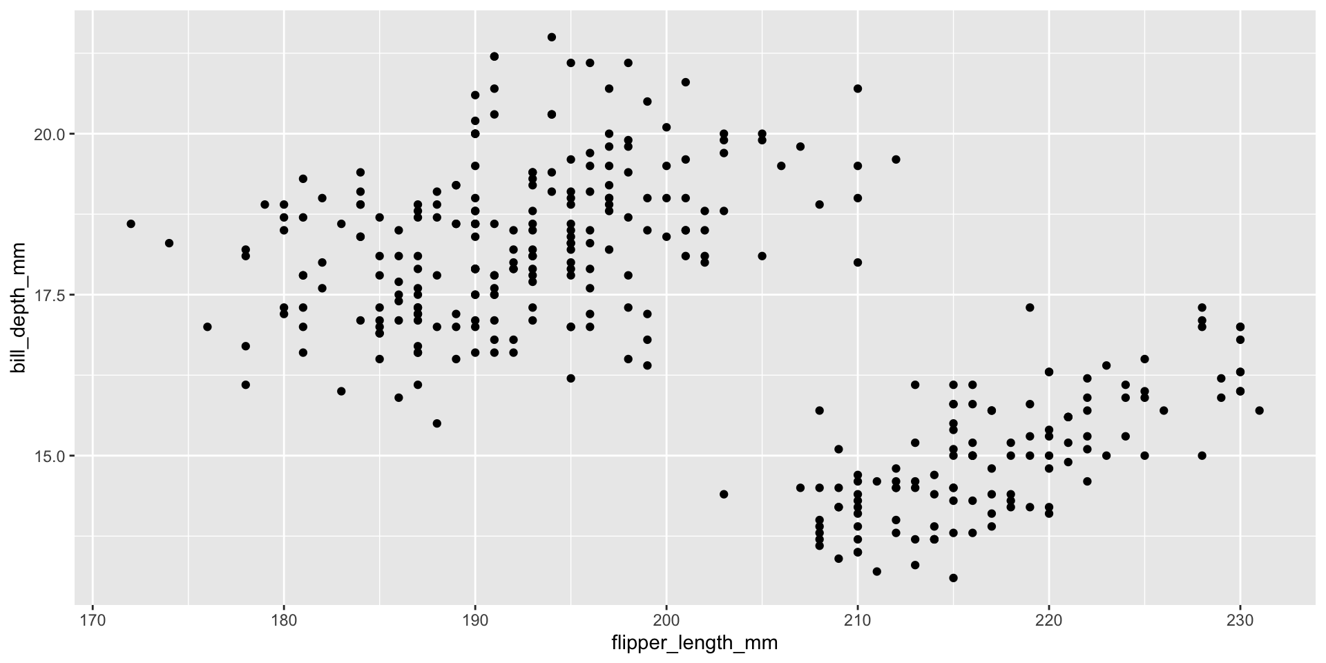
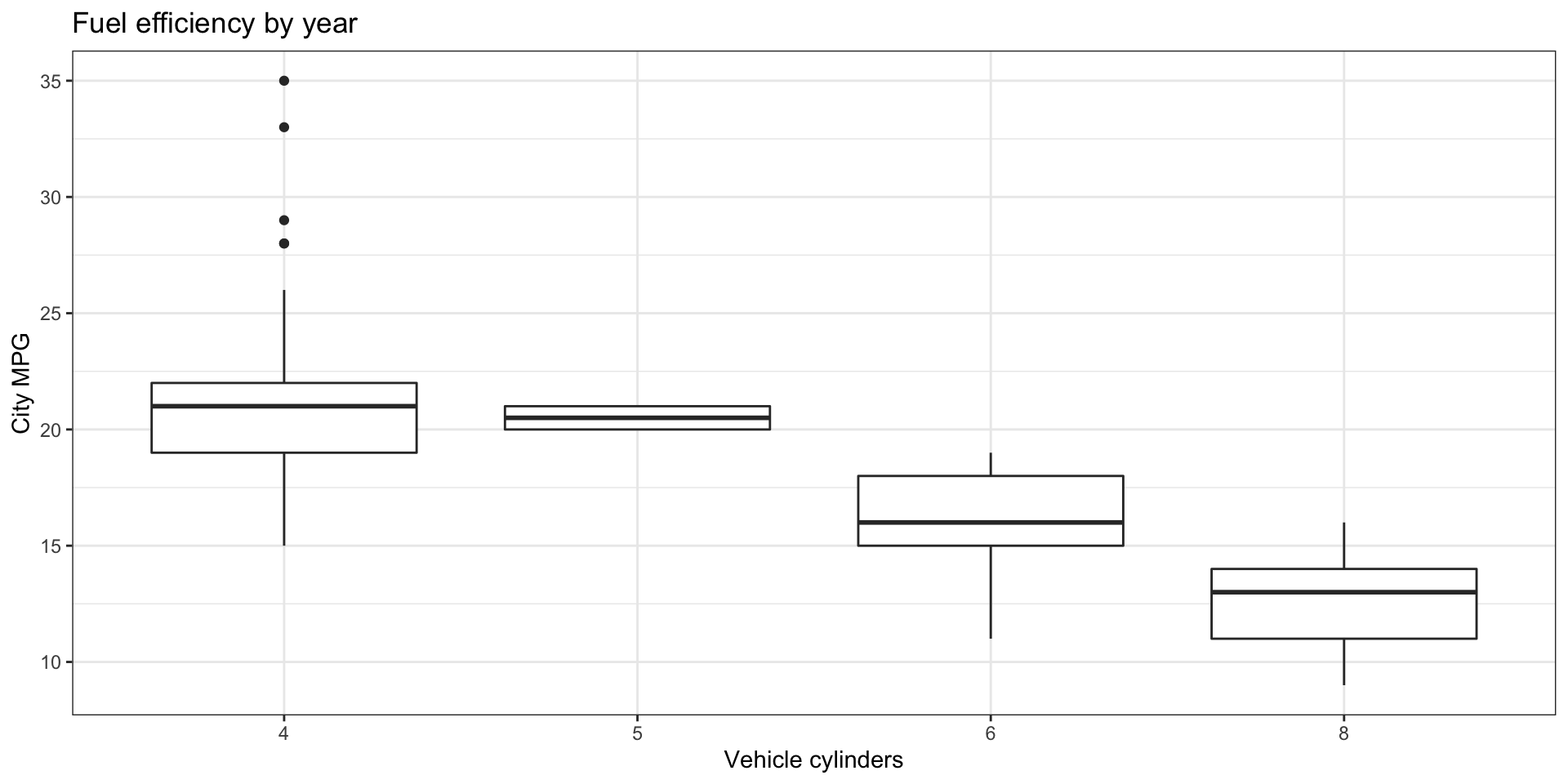
add a geometry
labels
add theme and color aesthetic
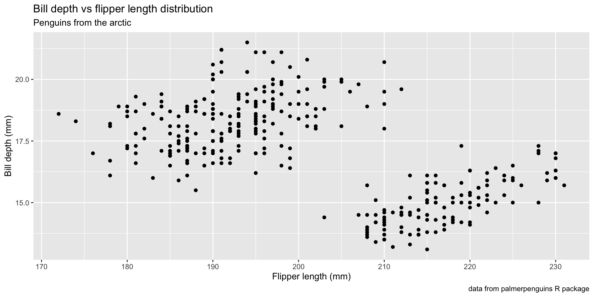
penguins %>%
  ggplot(aes(x = flipper_length_mm, y = bill_depth_mm,
             color = island)) +
  geom_point() +
  labs(x = "Flipper length (mm)", y = "Bill depth (mm)",
       color = "Island",
       title = "Bill depth vs flipper length distribution",
       subtitle = "Penguins from the arctic",
       caption = "data from palmerpenguins R package") +
  theme_bw()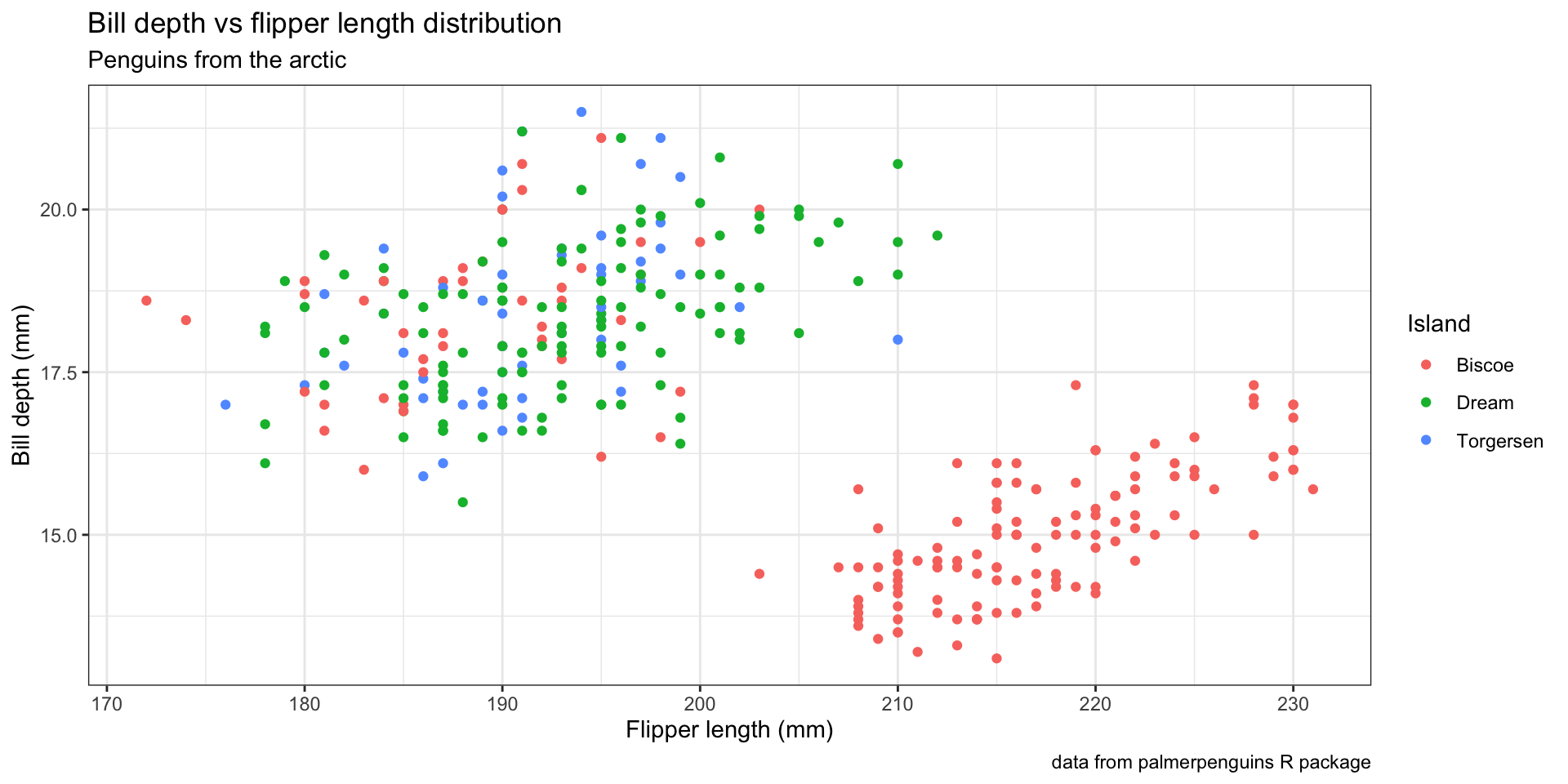
faceting
penguins %>%
  filter(!is.na(sex)) %>%
  ggplot(aes(x = flipper_length_mm, y = bill_depth_mm,
             color = island)) +
  geom_point() +
  labs(x = "Flipper length (mm)", y = "Bill depth (mm)",
       color = "Island",
       title = "Bill depth vs flipper length distribution",
       subtitle = "Penguins from the arctic",
       caption = "data from palmerpenguins R package") +
  theme_bw() +
  facet_wrap(~ sex)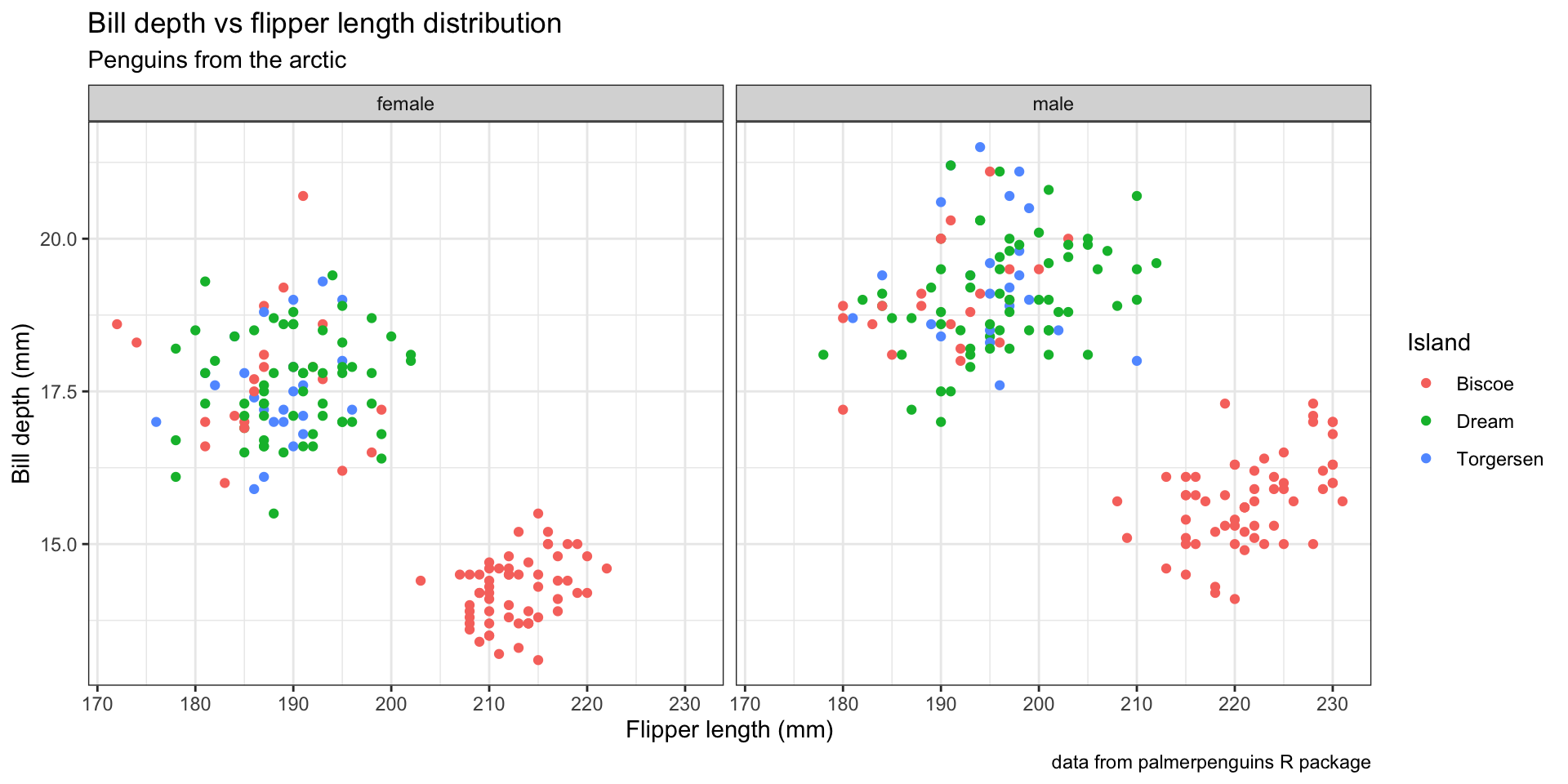
Variable mappings (aesthetics)
The name of the argument is mapping because it says how to “map” variables to a visual aesthetic.
When does an aesthetic (visual) go inside function aes()?
If you want an aesthetic to be reflective of a variable’s values, it must go inside
aes().If you want to set an aesthetic manually and not have it convey information about a variable, use the aesthetic’s name outside of
aes(), e.g. in the geometry, and set it to your desired value.
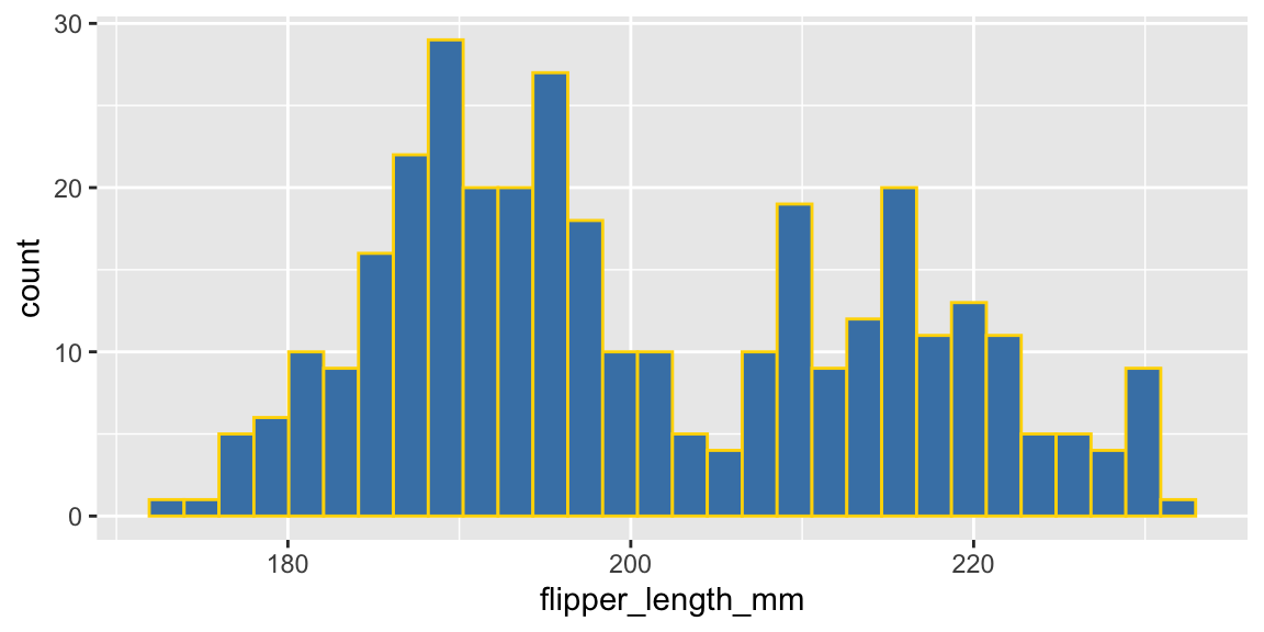
Continuous and discrete variables
Aesthetics for continuous and discrete variables are measured on continuous and discrete scales, respectively.
Rows: 234
Columns: 11
$ manufacturer <chr> "audi", "audi", "audi", "audi", "audi", "audi", "audi", "…
$ model        <chr> "a4", "a4", "a4", "a4", "a4", "a4", "a4", "a4 quattro", "…
$ displ        <dbl> 1.8, 1.8, 2.0, 2.0, 2.8, 2.8, 3.1, 1.8, 1.8, 2.0, 2.0, 2.…
$ year         <int> 1999, 1999, 2008, 2008, 1999, 1999, 2008, 1999, 1999, 200…
$ cyl          <int> 4, 4, 4, 4, 6, 6, 6, 4, 4, 4, 4, 6, 6, 6, 6, 6, 6, 8, 8, …
$ trans        <chr> "auto(l5)", "manual(m5)", "manual(m6)", "auto(av)", "auto…
$ drv          <chr> "f", "f", "f", "f", "f", "f", "f", "4", "4", "4", "4", "4…
$ cty          <int> 18, 21, 20, 21, 16, 18, 18, 18, 16, 20, 19, 15, 17, 17, 1…
$ hwy          <int> 29, 29, 31, 30, 26, 26, 27, 26, 25, 28, 27, 25, 25, 25, 2…
$ fl           <chr> "p", "p", "p", "p", "p", "p", "p", "p", "p", "p", "p", "p…
$ class        <chr> "compact", "compact", "compact", "compact", "compact", "c…
Themes
image credit:
tvthemespackage by Ryo NakagawraSee https://ggplot2.tidyverse.org/reference/ggtheme.html for a list of default themes.
Plotting functions
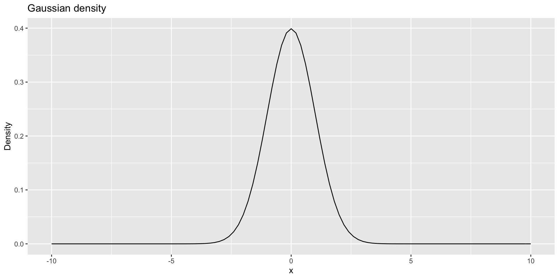
stat_function() is a powerful tool
Save the plot
- Save a plot as a file on your computer with
ggsave()
Annotate
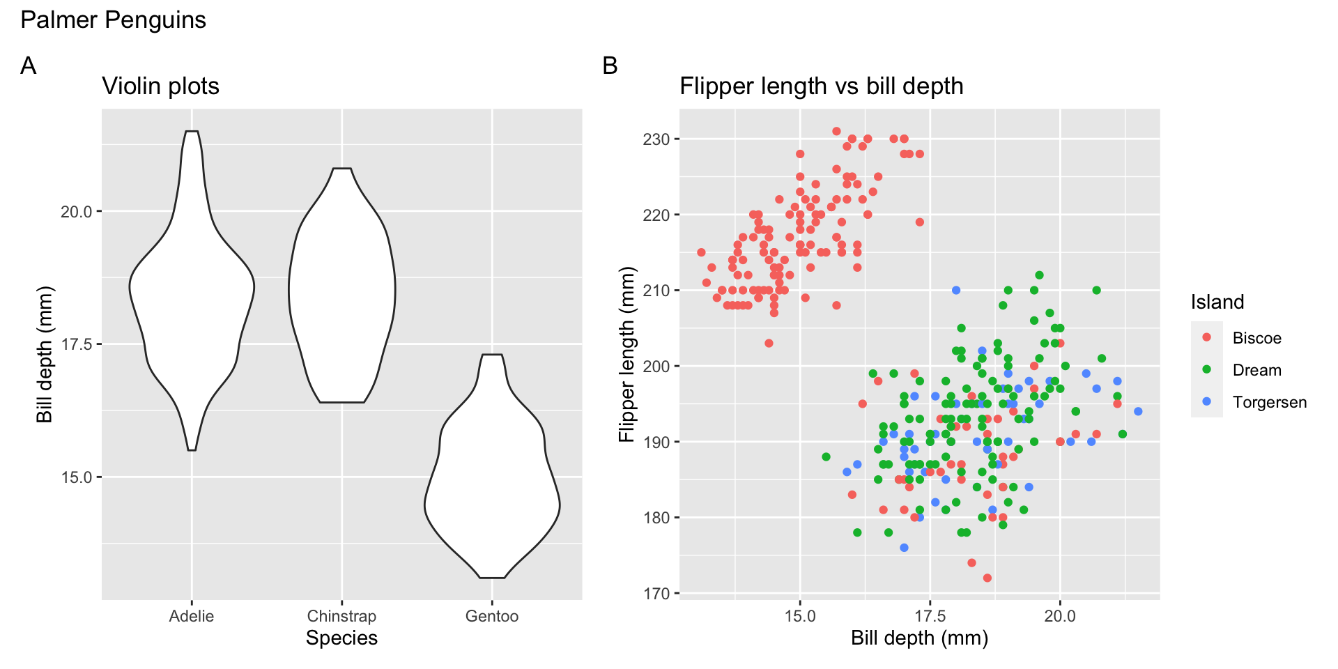
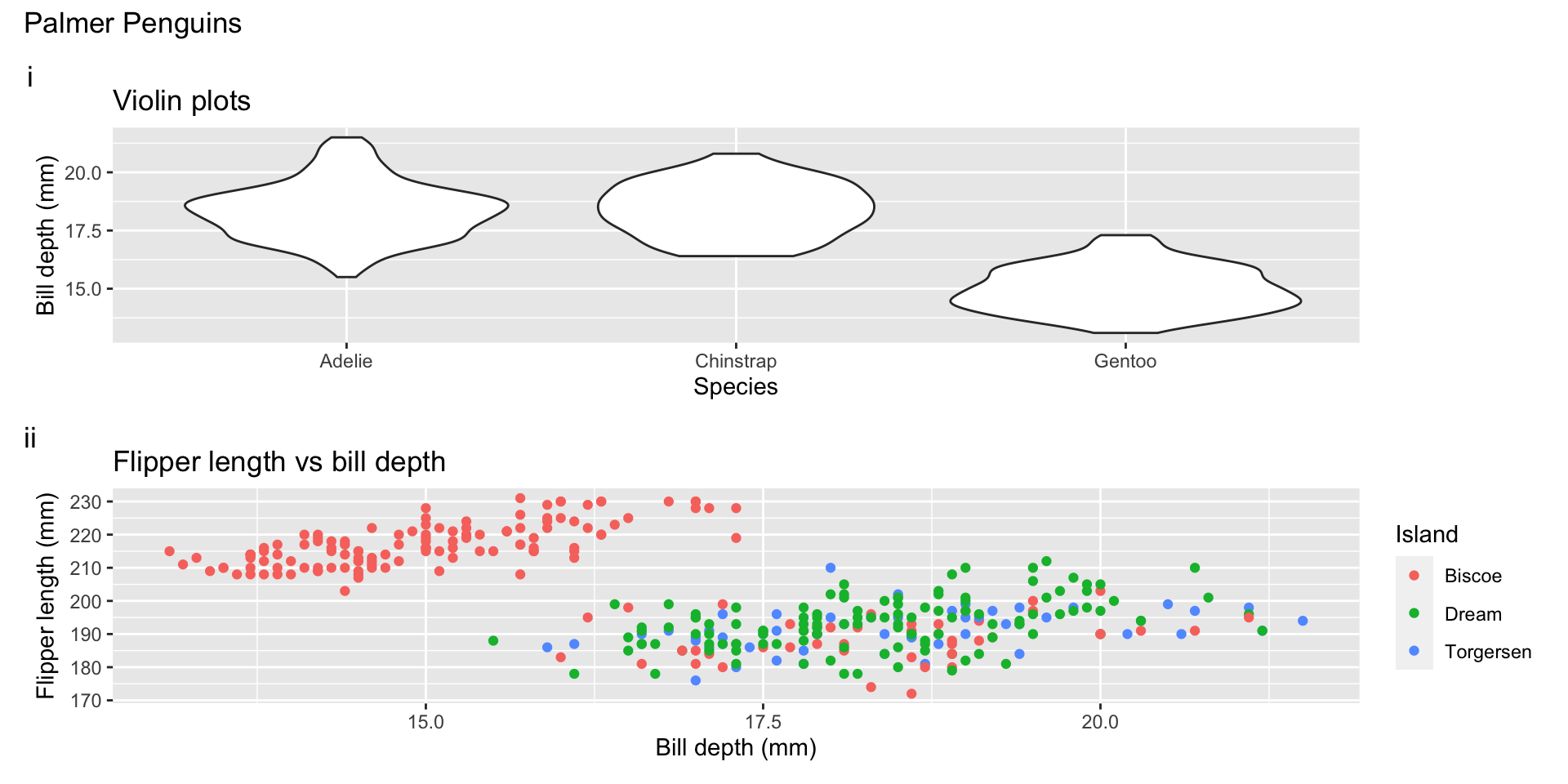
Patchwork
p1 = penguins %>%
  ggplot(aes(x = species, y = bill_depth_mm)) +
  geom_violin() +
  labs(x = "Species", y = "Bill depth (mm)",
       title = "Violin plots")

p2 = penguins %>%
  ggplot(aes(x = bill_depth_mm, y = flipper_length_mm, color = island)) +
  geom_point() +
  labs(x ="Bill depth (mm)",
       y = "Flipper length (mm)",
       color = "Island",
       title = "Flipper length vs bill depth")

p3 = penguins %>%
  ggplot(aes(x = body_mass_g)) +
  geom_histogram(fill = "steelblue") +
  labs(x = "Body mass (g)",
       y = "Count",
       title = "Distribution of penguin body mass")

(p1 + p2) / p3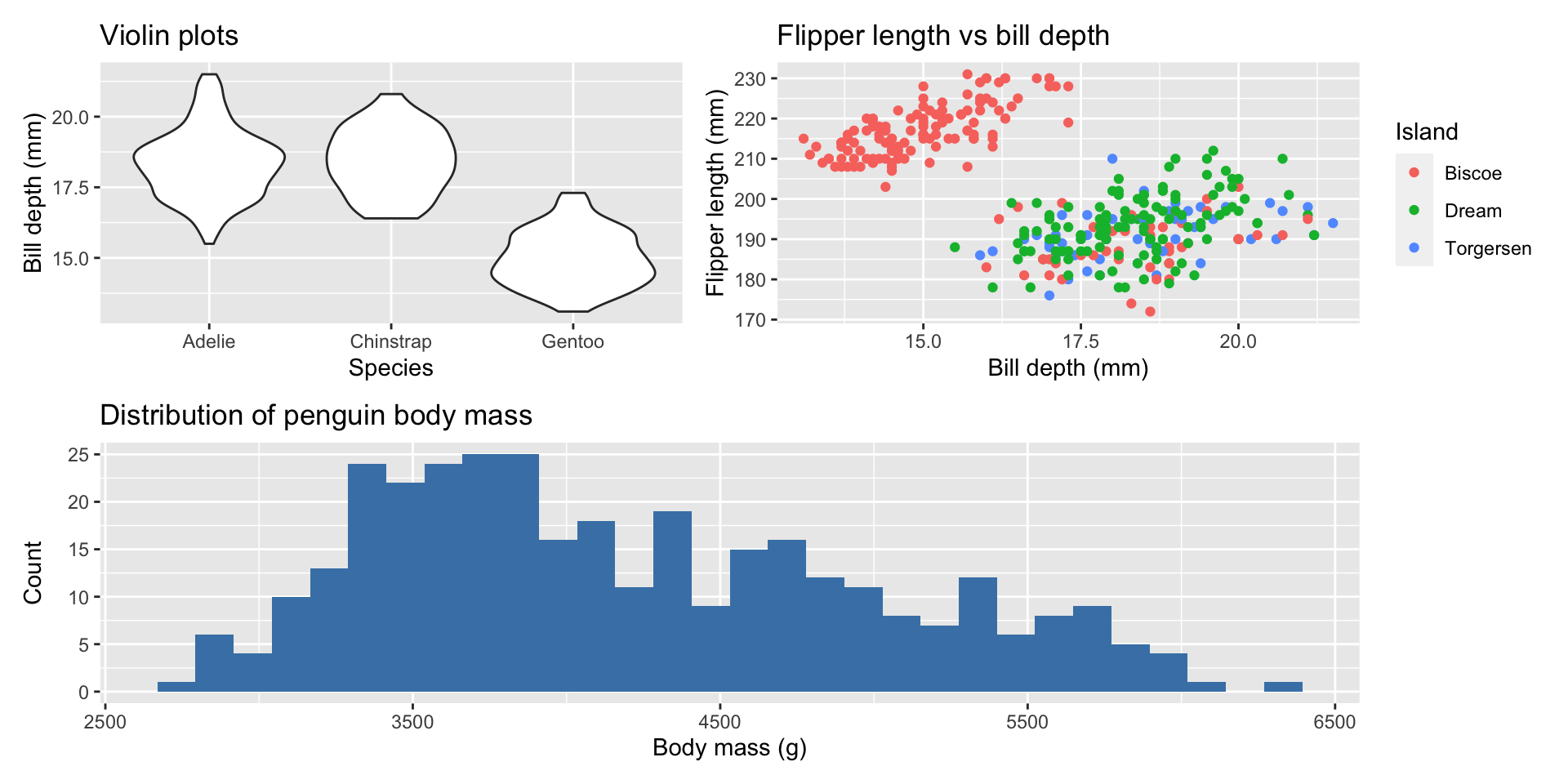
Patchwork layout
Custom ggplot functions with ggproto
Encircle the data points that have the minimum x-value
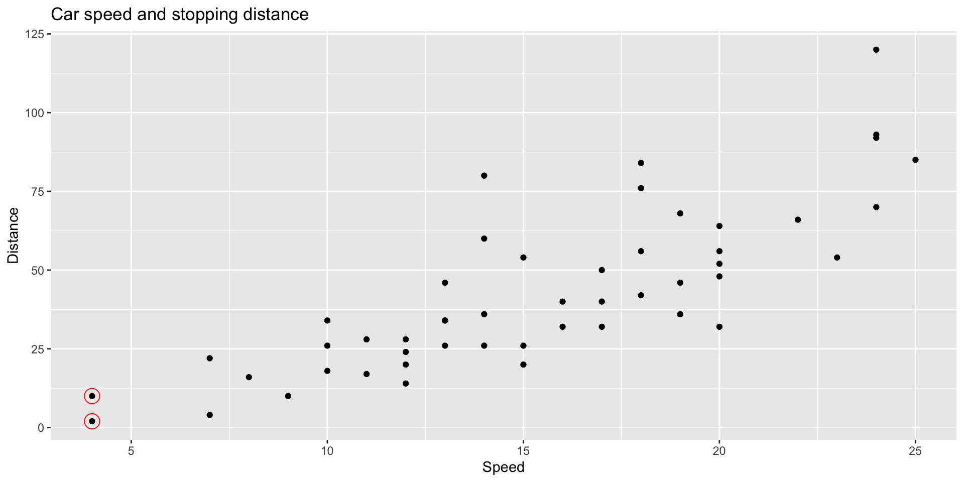
# create ggproto object
StatMin = ggproto("StatMin", Stat,
                       compute_group = function(data, scales) {
                          xvar = data$x
                          yvar = data$y

                          data[xvar == min(xvar), ,drop = FALSE]
                       },

                       required_aes = c("x", "y")

                       )

# create stat function
stat_min = function(mapping = NULL, data = NULL, geom = "point",
                         position = "identity", na.rm = FALSE, show.legend = NA,
                         inherit.aes = TRUE,
                         shape = 21, size = 5, color = "red",
                         alpha = 1, ...) {
  layer(
    stat = StatMin, data = data, mapping = mapping, geom = geom,
    position = position, show.legend = show.legend, inherit.aes = inherit.aes,
    params = list(color = color, shape = shape, size = size, alpha = alpha,
                  na.rm = na.rm, ...)
  )
}
gganimate example
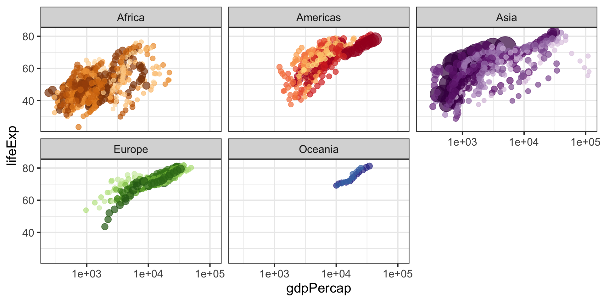
ggplot(gapminder, aes(x = gdpPercap, y = lifeExp, size = pop, colour = country)) +
  geom_point(alpha = 0.7, show.legend = FALSE) +
  scale_colour_manual(values = country_colors) +
  scale_size(range = c(2, 12)) +
  scale_x_log10() +
  facet_wrap(~continent) +
theme_bw(base_size = 16) +
labs(title = 'Year: {frame_time}', x = 'GDP per capita', y = 'Life expectancy') +
transition_time(year) +
ease_aes('linear')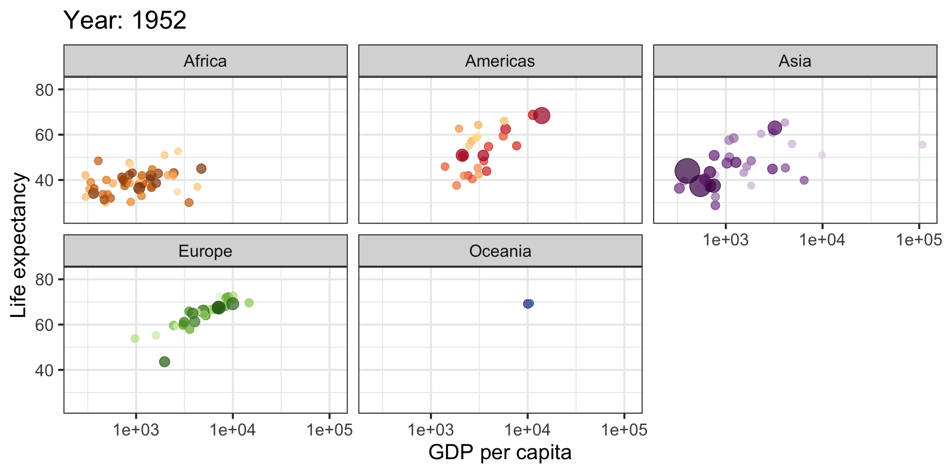
LaTeX labels